 Perfect
www.birmingham.gov.uk Alpha project - A usability review of council websites
simon gray — 2013-10-31, 11:31:44Back in late September 2012, as part of my work at Birmingham City Council, I instigated and led on a programme of incremental improvements to the council's website, blogging about the ideas and progress along the way, taking inspiration from Shropshire Council's Project WIP and the Government Digital Service work on www.gov.uk. The site on which I blogged has been taken down now, but I thought it worth reposting the more broad-reaching content from it here.
We of course have our own ideas about what makes a council website usable – and part of the point of sharing the work in progress of this project here is to test if our ideas are shared by our citizens and our industry peers. But it’s always best practice not just to rely on one’s own generalist expertise and one’s own individual consultation work, but to also engage the advice of independent specialist experts, to either verify your own findings or alternatively shed light on where your own proximity to a project might be skewing the results in favour of what you might want them to be – this process is sometimes known as red teaming.
To that end, we commissioned some independent usability experts from AbilityNet to do some work on our behalf – a quantitative benchmarking exercise of a number of other council websites, and a qualitative focus group exercise looking at our current website together with our plans for the next one.
To summarise a definition of what ‘usability’ actually refers to:
Usability generally refers to ease-of-use and consists of five components or attributes:
- Learnability: How easy is it for users to accomplish basic tasks the first time they encounter the design?
- Efficiency: Once users have learned the design, how quickly can they perform tasks?
- Memorability: When users return to the design after a period of not using it, how easily can they re-establish proficiency?
- Errors: How many errors do users make, how severe are these errors, and how easily can they recover from the errors?
- Satisfaction: How pleasant is it to use the design?
Quantitative analysis
The quantitative heuristic analysis looked at seven other council websites – city, unitary, and district, all of which either having had recent relaunches, being generally well-respected amongst industry peers, and/or regularly achieving four stars in Socitm’s annual Better Connected report. We asked the consultant to look at 10 common tasks which citizens need to perform on council websites:
- Pay your council tax,
- Find out school term dates,
- Find population and census information,
- Report broken street lights,
- Find information about the city’s economic condition and strategy,
- Find scrutiny committee reports,
- Apply for council housing,
- Complain about a missed bin collection,
- Find information about welfare reform, and,
- Find where a leisure centre close to me is.
The reviewer was able to complete all 10 of the benchmark tasks for seven out of the eight councils; for the eighth council he gave up on four of the tasks, including core tasks like finding school term dates; the total time to complete the tasks for six of the eight councils ranged between 203 seconds and 228 seconds, with the seventh council taking 310 seconds and the eight council 635 seconds – average times per successful task were 20-23 seconds, 31 seconds, and 37 seconds.
The reviewer was able to take all the metrics together and rank the eight sites in order of measured usability – there were no surprises which ones took the 1, 2, 3, and 4 positions – first was a council which has spent a lot of time over the last year or so carrying out in-depth open public consultation on its website development, second was the council which many have seen as setting the current trend for an alternative navigation paradigm, third was a site which had a new design launched earlier this year and was generally well received, and fourth was a site very much based on elements taken from the second and third placed sites. What was surprising was that the site placed seventh was one which has consistently been a Socitm four star site three years in a row.
Features of the reviewed sites as a whole which the consultant highlighted as aiding their usability included:
- Clear, concise text labels,
- Bold, but meaningful iconography,
- Primary and secondary navigation working together to indicate an obvious and focussed journey for the user to take without requiring guesswork,
- Top tasks presented in a prominent position on the home page,
- An accordian-style journey from primary through secondary navigation,
- A clearly visible A-Z index (preferably at the top of the page rather than the bottom) to provide additional flexibility for finding specific information,
- Room in the page graphic design for all the components to breathe rather than be cluttered,
- Clear calls to action,
- A large number of primary navigation items on the home page allowing users to complete the most common tasks quickly, and
- With more complex tasks the initial action needed to be taken to be clear.
Conversely, barriers to usability included:
- Scroll-stoppers – where the graphic design as it might appear on a user’s screen makes it look as if the whole content of the page fits onto the screen, ie where the content below the notional fold is hidden in such a way as to give no clue as to its presence – or worse still, where there’s a graphical element at that point on the page which looks like the end of the page has been reached,
- Pop-up / on-hover menus and navigation items which give little clue as to what lies beneath until the user activates them,
- Icons which are designed in an abstract form rather than as meaningful icons,
- Series’ of pages with identical link text and headings rather than being uniquely labelled,
- Key primary navigation elements which are hidden underneath small buttons in an obscure corner of the page,
- Large amounts of densely populated textual information,
- General clutter – an excess of interface elements, controls, and content on the screen at any one time, and
- Highly niche content given pride of place on the home page.
An important point made in the consultant’s summary was that having a large amount of information and links is not automatically a usability barrier per se, if that content is clearly grouped, well spaced in a clear font, and not too dense. And also, don’t make the common tasks easy to perform at the expense of making the complex tasks difficult.
Qualitative analysis
For the qualitative analysis aspect of the work we commissioned, two focus group sessions were held – one comprising a mix of students, council tenants, pensioners, and part-time retail workers, the other consisting of automotive sector employees, small business owners, property developers, creative sector business owners, food sector employees, and graduate public sector employees. All participants described themselves as confident using computers and the internet, lifelong residents of Birmingham, having a reasonable level of engagement with the council, and would generally prefer to use the council website over phoning us up, even though they might resent having to do so. The residents-oriented focus group had an age range of 45-67 with one 18 year old, and the business-oriented group had an age range of 37-58.
At the start of each of the two sessions the participants discussed some of the other websites they use on a regular basis – unsurprisingly, Google came high on the list, to the extent that there’s almost a perception developing of Google search results being the actual information some people are looking for, rather than gateways to the information. Other websites cited by the participants as being favourites were MSN, John Lewis, Next, Ikea, and Amazon; websites cited as difficult to use were H&M and Argos. Participants also pointed out how difficult pop-up / drop-down menus are to use on a touchscreen device – looking at the trend towards touchscreen even in the home, that’s something to be particularly aware of.
As well as our existing and this website, the groups were also showed some of the websites the consultant looked at for the quantitative benchmarking exercise; features overall participants liked were bold and meaningful icons, clear and simple link labels, simple navigation, a modern look, good use of images, ‘most popular’ sections, and positive use of language. Features criticised were unappealing colours, noisy appearance, too much text, link text wrapping over two lines, a lack of identity making a site look generic, boring design, unclear icons, distracting background images, and poor navigation.
Focus group one – residents
Of the residents-oriented focus group, only one participant actually indicated that they got frustrated if they didn’t find the information they were looking for within two minutes – the rest agreed they had no problem spending time on a website so long as they did find the information, and one person made the point that they spend 30-60 minutes on a site to carry out a complex task such as booking a holiday.
Most of the participants in the group said they used the council website for booking bulky waste collections, and were pleased with how easy that feature is – this actually tallies in with out own evidence from our complaints and compliments system, where the overwhelming majority of people who are motivated to send us a compliment about the website do so in relation to booking a bulky waste collection! Participants also, unsurprisingly, use the website for searching for information and for using the forms to report streetscene problems, although there was some disgruntlement about having to register for an online account for some forms.
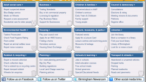 When asked what they liked about our current website, all of them strongly agreed about the feature we currently have on the home page which we call the Connecting Wall; they commented that most of the information they are likely to need can be reached from there, that they tend to look there first if they’re coming in via the home page, and they like the fact that they’re not waiting for a pop-up menu to appear. They also like the news panel on the existing home page – this tallies with other information we’ve seen that whilst industry thinking has it that most users aren’t interested in council press releases, anecdotally we hear that actually the presence of ‘news’ on the home page – by nature updated weekly or even daily – is something that users appreciate because it gives them confidence of the currency of the site as a whole. What they especially didn’t like was two sets of moving content on the home page, especially the movement in two different directions.
Reflecting what we’ve already discussed and found in the past, opinion was divided about the use of images on the home page – some want them, some people don’t, some people think the current design is boring, and others don’t think a council website needs to be jazzed up – though of course the design of the website needs to account for the fact that it is representing Birmingham to the outside world.
Looking at the proposed new site, disappointment was expressed that the Connecting Wall had been removed from the iteration of the home page that was in effect at the time the focus groups were held. On the boxes on the top level main pages containing links, the participants made the comment that the lists should be in alphabetical order – holding my hands up here, that was my fault as at the time of creating those boxes the content was actually hurriedly copied and pasted and I hadn’t had chance to alphabetise it, but it’s good to have definite feedback on something we already know to be true!
When talked through the five new major top levels, participants correctly deduced the kind of information which is expected to be under each, though they were strongly of the opinion that the transport and travel section – under About the city at the time – should have its home under Residents. When asked where they might expect to find four specific pieces of information, they only guessed one correctly – so we know that whilst the broad principle of the five top levels works, we also know about the extra work on the detail we must do.
Focus group two – business
As with the residents-oriented group, participants in this group mostly use the website for rubbish-related activity; generally they all said they could find information they were looking for, but not always particularly quickly. They also all agreed that they would be unlikely to use the general mobile app we’ve released. Only one participant specifically referred to their professional / business reasons for using the website.
Looking at the current website, like the residents-oriented group, all the participants were in strong agreement about the value of the Connecting Wall on the home page, although beyond the home page there was some agreement that information can be hard to find where there is too much information – and links – presented at once. The point was also made that people don’t go to a council website as an entertainment, so design and navigation features need to reflect that.
Turning to the proposed new site, there was overwhelming disappointment – comment was made about how drab the version at the time of workshop was, and that it appeared to be a papering over of the cracks rather than a complete rebuild exercise. Whilst we’re disappointed with this reaction, we’re not too troubled by it on the grounds that ultimately the new site will have a proper design rather than a functional design, and it’s possible they focussed on the content of the pages (which was just copied and pasted from existing pages) rather than the navigation. They did however make better guesses about what content would be found under what new top level, and like the residents group agreed that transport and travel should have its home under Residents rather than About the city.
Conclusions
From the exercise we can see a number of things fairly clearly:
- That whilst we know we still have work to do on the detail, the general direction of travel is sound,
- Important functionality needs clear calls to action to draw users towards,
- The Connecting Wall is an important and well-received part of the home page,
- As is the A-Z index,
- Iconography is important, but it must be meaningful rather than abstract,
- The site shouldn’t be ‘over’ designed, but it should reflect a sense of place rather than being generic, and
- Whilst you ignore the results of citizen consultation and feedback events at your peril, if you know you are correct and the feedback is wrong, you should stick to your guns; just because a panel of residents thinks transport information should only be under the residents section of the website, that does not necessarily mean they're right.
You can also read the full report and its terms of reference.