 Perfect
"There will come a time soon when for some councils there won't be a council website any more - the website will be the council" - Tom Steinberg, founder, MySociety
This is the second time I've opened an article with this quote - the first occasion was in March 2016 at the start of A Web strategy for local government. I don't normally do pithy quotes from other people in articles, but this one seems sufficiently relevant that it bears repeating.
Setting the scene - council website home pages
The standard council website home page
Go to any modern council website these days, and you'll see more or less the same layout of links on the home page - at the top, you'll see the so-called Top Tasks, links to specific services such as paying your council tax or a parking ticket or reporting a pothole or that your bins weren't collected, followed perhaps by some links to more general service areas, some links which will have been provided by the council's communications and marketing team to the latest council news stories and some marketing and information campaigns they want highlighting, and a series of other links which make perfect sense to the council but perhaps seem a little random to the website visitor.
A lot of the choices for links on the home page, particularly the Top Tasks area won't have come out of the website managers' heads, they will be data driven - if the most prominent four links at the top of your council's home page are to pay your council tax, see when the school terms dates are, report that your bins haven't been collected, and check for planning applications, that will be because the data for the website in question shows that out of all the people who are visiting the council website, they're the most numerous tasks all of those users in the aggregate are wanting to perform on the website. And for the most part, for most councils that data is going to look pretty much the same from council to council.
Does that fit you?
I don't know about a lot of people reading this, but personally I pay my council tax automatically by direct debit (and my wife, who is not the bill payer, does not pay it at all), this coming September will be the first time in 30 years of living here that the school term dates will be relevant to me, only a few times since I've lived in this house have my bins not been collected, and I'm generally a live and let live sort who is quite content to let planned development, whether it's the people three doors down wanting to build an extension or a supermarket wanting to build on empty land up the road, be done without the benefit of my opinion on the matter. In short, whilst the home page of a council website might meet the individual needs of an aggregated majority of visits to it, it doesn't meet my own personal needs as an individual citizen.
And the data shows that I am not alone in this, either
Taking the last 30 days of analytics data of www.birmingham.gov.uk, there were 3,839,287 total page views. The most accessed pageviews break down like this:
| Page | Total number of views | % of total | Positions |
|---|---|---|---|
| Home page | 137,121 | 3.6 | 1 |
| Login / account pages | 196,497 | 5.12 | 2, 3 |
| Jobs pages | 187,843 | 4.9 | 4, 5, 6, 9, 11 |
| Rubbish pages | 93,652 | 2.4 | 7, 8, 15 |
| Council Tax main page | 31,489 | 0.82 | 10 |
| School term dates | 27,508 | 0.72 | 14 |
| All other pages | 3,165,177 | 82.44 |
So to put it another way, on a typical council website home page, the three top service tasks on it account for 2.44%, 0.82%, and 0.72% of the total page views for the site.
It would take a piece of detailed analysis outside the scope of this article to drill through the data to see how many of the pages further down the list are part of the suite of pages featured on the home page, but at a rough guess based on the data already analysed, it's reasonable to suggest that the content of the home page is not what the overwhelming majjority of what the site's actual visitors have come to it to do, never mind the majority of the citizens the site is supposed to serve.
Of course, we also know from our data that most people using the site don't come in by typing the web address in their browser anyway, we know that 71.6% of visitors have come via an external search and only 15.3% of those visitors have come directly. What we are less clear on from a cursory glance at the data is how many of those searches are for '[council name] council tax' which would take them straight to the council tax page, and how many of them are searches for '[council name]' which indeed take them to the home page anyway. Regardless of this, the website's home page is clearly an important page - it sets the standard for all that lies within, it sets out the ethos of the organisation, and indeed it shows the ethos of the design of the digital service it's the principle representative of.
Survivorship bias
Essentially, how most councils have populated their websites over the years has demonstrated what is known as Survivorship Bias.

In the image, the red spots indicate example locations of bullet holes in planes which returned from air battles during World War 2. When looking at where to add additional armour plating to the planes, the group looking into this naturally concluded that where the holes are were the obvious places which needed to be strengthened. However, the mathematician Abraham Wald realised the opposite was in fact the case - since these were the planes which returned, clearly the bullet holes in those locations weren't actually a problem; he concluded that the parts of the planes needed strengthening were the areas not showing any holes, because those were the planes which weren't returning, therefore it was likely damage to those parts of the plane which were the most problematic.
The way as a sector we have used pageview data to design our home pages is a kind of Survivorship Bias; since those pages featured on our home pages are the most accessed, clearly users are finding no difficulty in finding them; and indeed, we know most users aren't even looking for those pages anyway, they're looking for every other page on the site.
We may never get it perfect, but I contend that the current local government website home page design strategy as has been adopted across the local government digital sector the last 10 years is up for revision.
Customer satisfaction
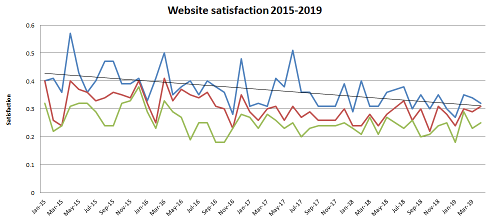
For the last year or so I've been keeping an eye on the monthly Govmetric channel satisfaction emails. Govmetric's methodology is based users clicking a little widget with three faces on it - if the user clicks the green smiley face, that scores a 1, if the user clicks the red frowny face, that scores a -1, and if the user clicks the neutral amber face it scores a 0. The scores are added up every month and divided by the number of entries to produce a satisfaction index - so a positive score indicates users have been broadly satisfied during that month, a negative score indicating broad dissatisfaction, and a score around 0 indicates users are broadly content, considering the site to be not great, not terrible.
Over the few years I've been keeping track, satisfaction for the top three councils for the telephone and face-to-face channels - channels which in most councils have faced significant cuts, with neighbourhood offices being closed and moved to appointment-only and with telephone queue times increasing - have remained consistently high around the net 0.9 score, and indeed increasing slightly over time, with the top council's face-to-face score in April 2019 achieving the maximum possible 1. The top three council's web scores have been consistently much lower in the 0.25 to 0.3 area, and in the time I've been following there has been a slight, but consistent, drop in levels of measured satisfaction, with the top council achieving 0.4 in January 2015, and the top council in April 2019 acheiving 0.32. Council number 10 on the April 2019 list acheived a score of 0.05 from which we can make a reasonable deduction that most of the council websites using Govmetric are achieving negative levels of satisfaction.
We can make all kinds of speculation about why satisfaction has been decreasing over time; ideally we will ask our users. We can speculate that people are expressing their dissatisfaction with the council's actual service delivery rather than expressing dissatisfaction with the information and reporting platform, but that does not explain why citizens are generally well satisfied with the telephone and face-to-face channels. We can say that the warm fuzzies of human contact make people feel slightly less bad about getting a rubbish service, we can say that in an Amazon and Facebook world people have higher expectations of an online service so will be more inclined to click their dissatisfaction with ours.
But these various possible speculations are just self-serving excuses. The data clearly and unequivocally shows that our website home pages do not meet our citizens' needs, and our sites as a whole are not meeting their expectations; at best, the work we as a sector have been doing over the last three years has failed to keep pace with citizens' expectations, at worst, we have been actively annoying them.
We may never get it perfect, but I contend that the current strategy as has been adopted across the local government digital sector the last 10 years is up for fundamental revision.
If the limit of our ambition is to get more citizens paying council tax and reporting potholes online rather than phoning up to do that, then we will be failing from the outset. We may never get it perfect, but we at least have to try.
What does a good local government website look like?
One of the websites which consistently features at the top end of the Govmetric satisfaction top 10, ie, in the not great not terrible range, is the site for the States of Jersey; not strictly speaking UK local government, but close enough for the purpose under discussion. When I was discussing this in the office, a friend and colleague, new to working in the local government digital sector, went to look at their website and landed on https://www.jersey.com/ . 'Wow', they said, until I pointed out that was the tourism promotion website, and Jersey's government website is https://www.gov.je/ , which looks somewhat more like any standard UK local government website.
Why is it the limit of our ambition to build websites which look like standard local government websites? Why is it not our ambition to build websites with the same vibrancy and attractiveness of tourism promotion websites? Both classes of websites have the same intrinsic goals - to attract users to the site to engage them in what the organisation (be it the city or the council) has to offer, and to pursuade them to make a quick decision to act there and then. There is no inherent reason why we have to present our top tasks - such is the importance they'll always have on our sites, however they're determined - in a boring plain white oblong on the screen, there is no reason why we cannot present our top tasks in a manner which makes the user go 'wow'. We will never make a user feel good about paying a parking fine, but if we make the experience of paying it be done a little more flair we might make them resent it less. If we make the information about parking in our districts easier to navigate, more engaging to view, and more up to the minute when they park their car, people might incur fewer parking fines in the first place. And if we put the same amount of effort into making the pages on the website containing the county's parking strategy as engaging and readable as the website editor of an online general interest magazine puts into making an article engaging and readable, then we'll have an increase in the number of active and civically engaged citizens who better understand the thinking behind the decisions we have to make and are less likely to complain to us when we have to make difficult ones based on impossible choices.
It would be a brave local government website manager indeed who stopped showing links to the most accessed services on the website home page, for sure, but the data tells us we have scope to make our user experiences a bit more interesting.
The future
So what might a digital service fit for the next five to ten years - yes, I accept we have to still be pragmatic about the constraints we're under even though I want to raise the threshold of our ambitions - start to look like?
It should be a number of things. It should be:
- responsive,
- proactive, integrated, and timely,
- lean,
- modular,
- personal, and
- engaging
Responsive
This does not mean the same website looks nice on your laptop screen as well as your mobile phone screen. It means it should adapt according to all changing conditions, as automatically as possible. If a service depends on the time - such as for example if a citizen can't report a missed bin collection until after 3:30pm on the collection day (because until 3:30pm the crews are still collecting), then don't give them the option to report it before 3:30pm that day, rather than annoying them by letting them start the process and then annoying them. If it's a page about a building, service, or event with open and closed times, if the user visits when the thing is closed put a message on the page to say it's closed, and when it will be open again. If it's a page about events in the area, if it's raining or cold right now prioritise showing the indoor events, if it's sunny and warm prioritise showing the outdoor events.
Proactive, integrated, and timely
Personal digital assistants such as Alexa and Siri are proliferating in the home. I've manually set mine to tell me several times during Tuesday evening every week to do the bins. A digital service which can be integrated into a user's PDA could not just automatically be set up to do the reminder, it would know which bins need to be done on any given week. A digital service which is proactive, integrated, and timely would be tracking and displaying the route of the bin wagon in real time, so that if first thing on Wednesday morning I realise that despite Tuesday's reminders I've still forgotten to put them out, I can see if the wagon has not reached my house yet so I can quickly put my dressing gown and slippers on and catch them before they get to me, and if for whatever reason the bins end up not being collected, I can see the route the wagon took before it decided not to come down my road, and I'll get a message telling my why they didn't collect my bins and when they'll get collected instead so I don't even need to report a missed collection. If I see a pothole, broken manhole cover, or faulty traffic light during my daily walkabout and go to report it, if on the reporting page I can see it's already been reported then I don't need to waste mine and the council's time reporting it again.
Lean
Most councils are working with a plethora of line-of-business systems for managing council tax records, housing records, planning applications, committee meetings, street defect reports, etc. Most of which are mutually incompatible (even when created by the same vendor), many of which were designed and built in an earlier age. A lot of effort has to go in to making online systems talk to each other. Sometimes it can't be done at all, so either an online service involves double-handling, or it doesn't happen at all.
The work that most of these systems need to do isn't inherently complicated - most of them are just databases containing records which are created and edited according to a workflow, with various outputs and reports. There is an opportunity for local government digital service providers to clean up here looking at some of the worst examples of poorly designed line-of-business systems and creating modern alternatives. And after all, if the citizen goes to the council website to find out information about logging a planning application, why can they not log that planning application on the same website, and the planning department access and workflow that application through its whole life in the planning cycle in the same system. Planning applications will thus also show up in the local area search on the website - and of course a citizen will also be able to get proactive notifications from their online account of new planning applications related to their chosen area(s).
Modular
Of course a lot of local government digital service providers won't want to get into the business of trying to enter a market for a system that another provider already has significant market share and expertise in delivering - they might want or need to just concentrate on their own particular offer. There's no shame in that. However, if all local government systems were to work with open standards and open APIs, with full two way integration that is easy to set up and configure between different systems, then that's fine. If I submit a planning application on the website, a two way integration to the separate planning management system will still make it look to me as the citizen that I'm dealing with one council digital service. With open standards and APIs there will be no need for people configuring different systems to go through the pain of trying to make the public-facing versions of those systems look the same - and then have to update them all when the main council website gets a site refresh, because the data from the LoB system can be surfaced to the website via JSON or another technology. And of course a digital service designed and built in a modular fashion able to easily recieve the data from open APIs doesn't just need to be restricted to other council systems, it could receive relevant data from central government systems, it could receive data from any other system.
Personal
Since the council knows that I already pay my council tax automatically by direct debit, there should be no need for the council website to encourage me to pay my council tax every time I go to it. Since the council can see that I look like I live outside the borough rather than in it, it doesn't need to promote so heavily all the services directed at residents, it can instead prioritise showing services directed at visitors. Since the council website is anonymously tracking my user journey behaviour anyway, why not introduce the option for it to explicitly track my personal user journey behaviour, so that over time it can learn which pages I access the most and offer them up to me in the home page top tasks area, rather than offering the top tasks everybody else apparently is interested in? And give me the option to add my own shortcuts on the home page. Why do I have to login to access some of this personalisation, if the personalisation is not personally sensitive - why can't there be an option for some of those preferences to be stored and available to me without an explicit login? And since the website can be configured to receive data from external sources via open APIs, why not enable me to configure the data I want to see myself on the home page from internal and external sources, so I can build up my own local portal?
Engaging
If we make people go 'wow!' when they come to do something trivial, and make people go 'wow!' when they come to do something important, then they'll tell their friends. Their friends will tell their friends. The local media will tell its readers how good the council digital service is and how well the money is being spent. We'll achieve our channel shift and savings goals because people will not want to interact with us any other way - for those people, the council website will indeed become the council.
If we limit our ambition to getting more people to pay their council tax online, then we'll probably struggle to even achieve that. Let's raise our ambitions to create digital services which make people go 'wow!'.
This is Part One of the Manifesto. You can also read Part Two of it, with future parts to follow in due course!